What is behaviour mapping?
Simply stated, it is just that: Mapping people’s behaviour. However, there are very different ways to do so. The ways to map behaviour not only vary on what types of behaviour are mapped, but also in the ways it is done.
Behaviour is a complicated thing. Everything you do can be understood as behaviour. How you get up in the morning, how you make your breakfast, the fact that you go to work or study, how and with whom you interact during the day, and so on. Likewise there are many things that influence your behaviour; what you consider normal, what is most efficient, what you value, what others do, and so on. Behaviour is the conceptual term for how people act, whereas the concept cognition deals with how people make sense of the world[1].
The word ‘mapping’ means to note down information so it can be better understood. (The process of map-making is cognitive, while the information recorded is behavioural.) The maps of the world, of countries, or even infographics, all map information in a specific way to make some part of the world around us understood. What your question is exactly, and how you decide to visualise the data will play the most important part when you start with behaviour mapping.
What are good questions?
Good questions are questions that can be answered. This might seem very straightforward, but it will prove to be much harder once you get started. Good questions have the how, when, where, what, and who in them. So not just the questions ‘what food is good?’ but instead ‘what type of food for dinner is liked most by adults in the Netherlands?’. The latter one is much more focussed and therefore easier to give a scientifically sound answer to. This last bit is important, because behaviour mapping is not about (your) preference; it is not supposed to be subjective data. The goal of behaviour mapping (or in any case any other scientific method) is to understand some phenomena in the world that other people can use. The question is usually not how you, personally, understand the world because that would make you the subject of the research. Thus, when doing scientific research, try to stay as objective as possible, and otherwise, mention how your own perspective might have influenced the interpretation of the results. Therefore, asking a well-defined question is important. It helps you define what you really want to find out and makes this clear for others as well. Finally, it helps with framing your answers and conclusions in a context once your research is done. For ideas on how to measure the behaviour you decided to look at, it is wise to search for similar research that has been done before. This might not only give you another perspective on the topic, but it can also help to focus your research more by giving suggestions and avoiding pitfalls.
So what is the behaviour you want to map, and in what context?
How to map behaviour?
There is not one way to map behaviour. You can see this as both positive and negative; you have the option to tailor the behaviour mapping to what suits your research question best, but, you have to really think about it and cannot just copy any other behaviour mapping that has been done before.
There are several questions that you should be able to answer to plan for your behaviour mapping:
- What type of behaviour do you want to map? (walking, cycling, sitting, talking, etc)
- At what time do you want to map? (morning, evening, during work hours, etc)
- How long do you want to map? (morning, summer vacation, five minutes, intervals, etc)
- Who will you map? (adults, children, male, female, groups of friends, etc)
- Where will you map? (a traffic node, an airport, a house, one room, etc)
Based on the answers to these questions, you will get an overview of what kind of information and how much information you need to map. How groups of people walk in a public park requires a very different notation than how someone sits down at a bench in that same public park. This brings you to the next set of questions, namely those on how to organise the mapping:
- What can you prepare beforehand? (floor plans, counting sheets, etc)
- What medium will you use to map? (paper/pen, photo’s, sound, video, etc)
- From where will you map? (a central point, several corners, etc)
- How many people do you need to map? (just you, 2, 10, or more days, etc)
When you have an overview of these issues, it is time to figure out how to map the information.
Here the materials that you can prepare beforehand are important. You have to make sure that you need as little time as possible during the mapping itself, while getting the information you need out of what you see. The research question you stated before will be of great help here too. For moving behaviours it can be useful to draw lines. If you need to differentiate between categories (type of people, time, number of people, etc) it can be useful to use different types of lines (thickness, colour, dashed) but changing lines might also take up more of your time. The scale of the drawing should match the detail of your question. For different types of behaviours, you could code them beforehand (sitting = o, reading = +, watching = *, etc). To map how long someone does something, you can use numbers, or code the beforehand. You have to decide before the mapping what you will look at and how to note it down to make sure the sheet will remain understandable; using ten different coding systems will provide you with lots of information, that is if you can still read it. So think through thoroughly what you are going to code/note down and how, and make sure that it will result in the information that you need to answer your well-phrased research question.
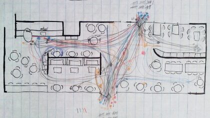
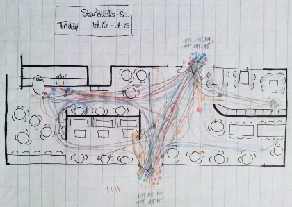
In the images below the routes of people entering a Starbucks were recorded. Different colours were used for different people, so routes were easier to follow. However, there was too much going on to keep track of everyone, let alone switch colours. Thus, when you are going to map, keep in mind how much time you have to record all the data you need. The map below did not pay attention to age, sex, time inside, etc, only the routes.
How to interpret the maps?
When you have carried out your behaviour map, that is not the end of your search. You need to interpret the results and make some sense of it. Your first task is to convert the data in your maps to a usable format. What is usable depends again on your research question, but also on the type of mapping you did. In theory you need to put all maps on top of each other, to be able to say something general about the sample. However, if you literally put all maps on top of each other, it is not likely that you are still able to read them. Also, you probably want to focus on different aspects of your research question and sort through categories (whether they be dates, times, behaviours, locations, or types of people) to say something about each of them. Simply put, you need to change your visual maps into numbers. ‘Why numbers?’ you might ask. The thing here is, that if you want to be able to say there is a significant difference between categories, you need to be able to prove it. And a visual difference is, scientifically speaking, very often not enough. To get an objective interpretation, you need numbers to strengthen your argument.
Statistics come in handy here, but for someone without a background in statistics and instead with a more graphic background, there is a way around it. If you look at the maps you made, they have a scale, thus, there are numbers. Behaviours do not exist in a vacuum; they are always set in an environment, in a time-scale, in a context. Because you have a well-phrased question, you should be able to give the variations in behaviours that you observed a category (indirect number or ordinal variable), or a direct number (numerical variable). After you have entered the data into one format to get a good overview, the analysis can start. For a good overview on how to do statistics using SPSS, go here: https://www.ssc.wisc.edu/sscc/pubs/spss_students2.htm.
In any case, keep in mind what a difference in numbers really means. A difference of one is not very likely to be significant on a scale of thousand, whereas on a scale of three it probably is. Keep asking yourself the question why a result is different, and what that difference could mean. Your observation is an interpretation based on the information you have. However, it is not possible to measure or control for all variables of influence because there are simply far too many. So the significant difference you see might not even be related to what you predicted in your question; it could be something that you did not include in your study.
Take for example a study that measures type of transport used during the week for work and relate this to distance. If there is one person who walks instead of bikes but lives quite far away from work, you have to try to find an explanation. This could be either because the person likes to walk, a bike is too expensive, because the person is not able to bike, or many more reasons. So then the reason this case is different is not based on distance, but for example on the availability of transport. This explanation would change your interpretation of the difference in results. So what is important here is that you do not stop asking questions once you have the maps but really do get to the bottom of things.
How to get to a conclusion?
The conclusion is the roundup of your research. This is the part where you get back to your research question, and phrase the answer. After formulating the answer, you should also note down other things you found out during the analysis that relate to your research question. Finally, this is also the part where you explain how you are going to use the results in a design (if you are a designer). If you want to do this properly, you do not only write down your own answer to your question, but you also try to find other literature that relates to your question to put the research in a context. Also, if your results show something different than expected, this is where you can try to find an explanation for that. And most probably, your research raised new questions that you can describe here shortly as an advice for others, to continue the search for answers.
Tips for the graphic presentation of the results
Just as for any presentation drawing, you need to focus on what you want others to see on your picture. Is it different behaviours for different user groups? Then make sure the different user groups are easily distinguishable. Are the behaviours during various times in a day important? Then highlight those. Make sure the context of your study is visible, but keep the pictures simple. Think of yourself looking at information, and what you need from the picture. Then, remember that the person looking at your picture probably knows less about the research than you, and simplify it once more. Good luck!
[1] In Baron, Byrne, & Branscombe, (2007). Mastering Social Psychology. Pearson Education, Inc. (Page 9).